Components
Visual Foundations
Data Visualization
Interaction Patterns
Tonic Design System
A design system created for Vision One, Trend Micro’s B2B security platform. It provides a consistent foundation for designing and building cohesive product experiences.
Product
Trend Micro Vision One
Role
UI/UX Designer
Project timeline
2020-2025

Establishing a visual language for a security platform
As a security platform Vision One needs a professional and composed interface. Its screens also present a high volume of information, so components must balance readability with information density. Motion should be used carefully to avoid disrupting users, and text-heavy content needs to remain easy to scan and understand.
Balancing accessibility with security status recognition
The product often needs to meet WCAG AA contrast requirements. Color choices must support the visual system while keeping text and interface elements legible. Security levels also need clear, consistent color definitions so users can recognize statuses quickly.
Distinguishing brand colors from security status colors
Trend Micro’s brand red is a recognizable part of its identity, while red in a security interface can also signal danger or an alert. The use of brand colors and security status colors therefore needs clear boundaries to prevent users from confusing brand messaging with risk signals.
Building the Design System alongside the product
The product and the Design System were developed in parallel. When a new request came in, the work involved more than addressing the immediate interface need: it also required evaluating whether the solution could be reused and should become part of the Tonic library.
The design focused on simplifying navigation and organizing controls in a more logical way. Clear hierarchy and spacing helped separate key actions from secondary options, making the interface easier to scan and use.
Through several iterations, the interface became more streamlined and consistent, allowing users to interact with the device quickly without needing to search for core functions.

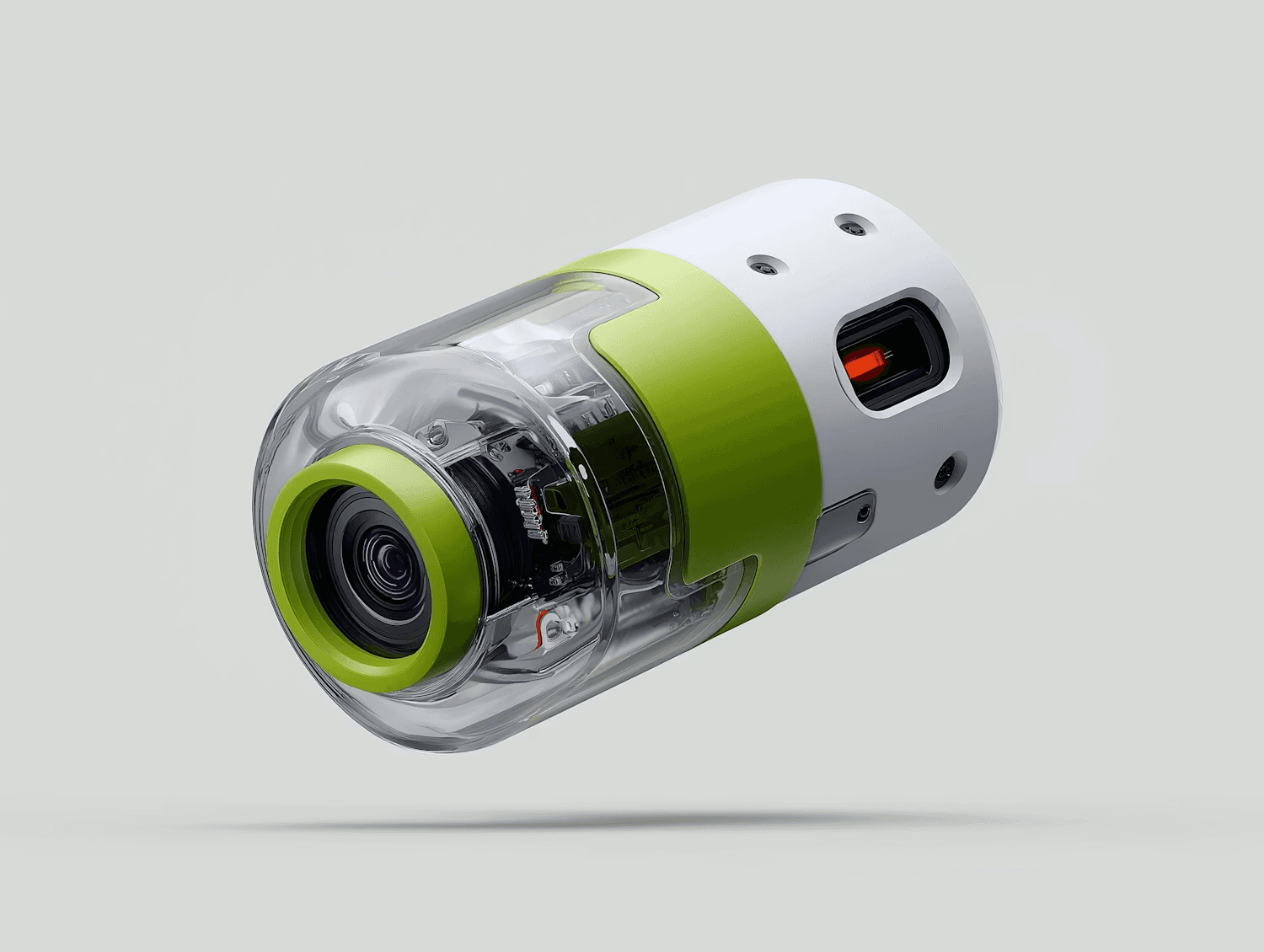
The final result introduced a clearer structure and a more approachable interface. Key controls became easier to locate, interactions felt more predictable, and the overall experience became simpler to use in everyday situations.